Websites that turn homeowners into booked calls not just traffic.
Most contractor websites actually get decent traffic, but:
- Confuse homeowners
- Answer the wrong questions
- And leak leads to competitors

What I actually build (and why it works)

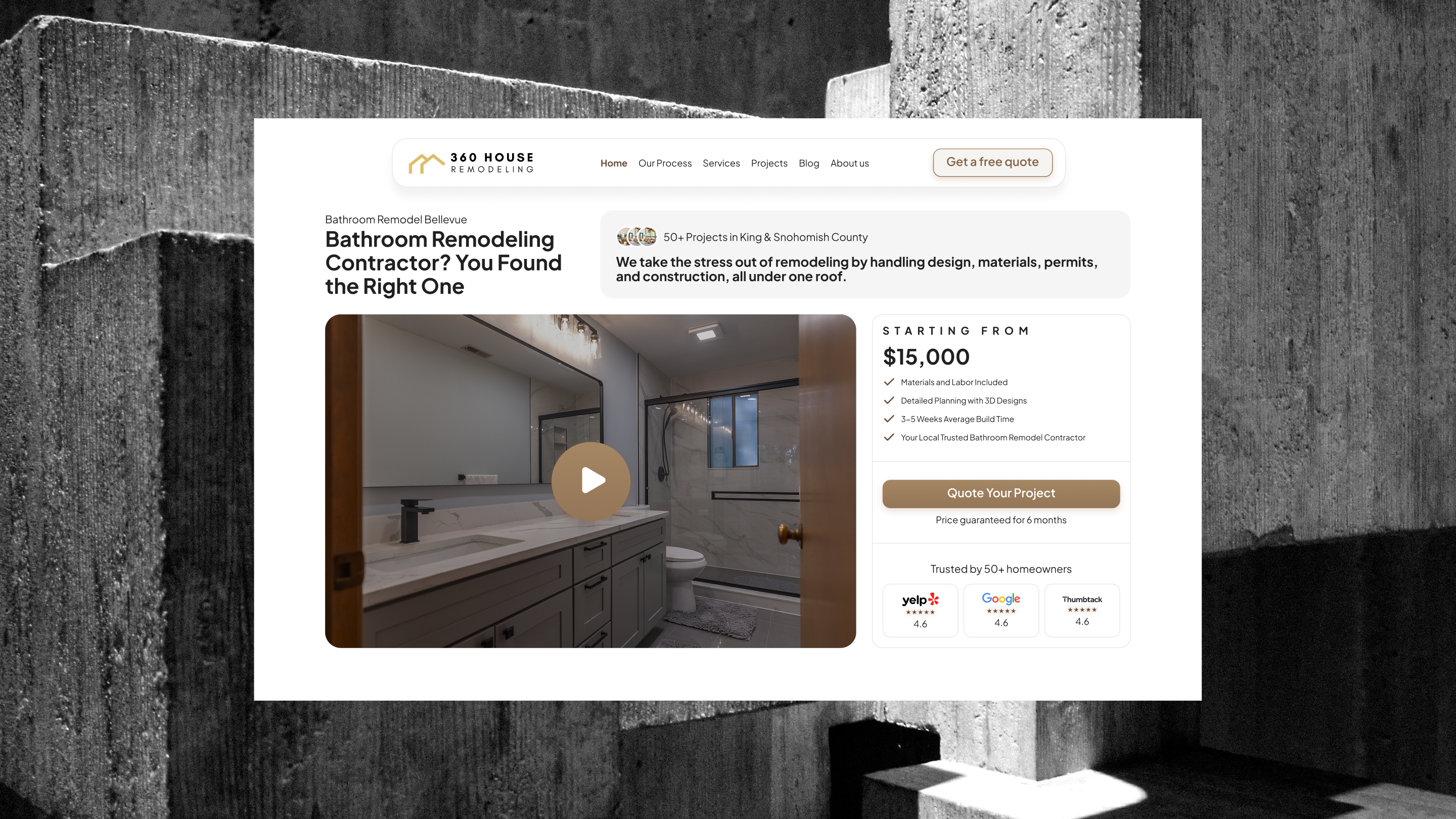
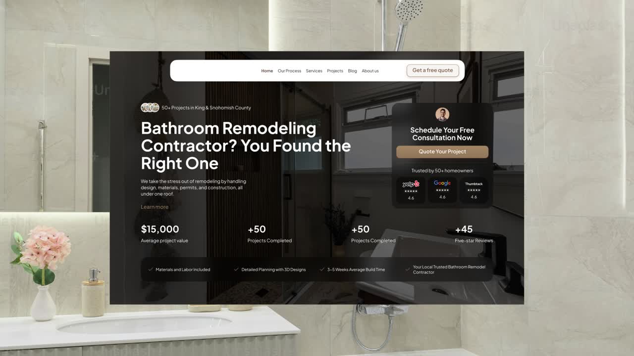
How 360 House Remodeling's website is going to achieve a new stage in their business
This project focused on helping a remodeling contractor move away from a “good enough” website and toward a digital presence that actually does some of the heavy lifting before a homeowner ever reaches out.
The goal wasn’t just to make the site look better. It was to create clarity and confidence for homeowners who are already overwhelmed by the remodeling process. That meant clearly explaining services, setting expectations, and using real project visuals to communicate competence—so visitors immediately understand who this contractor is for and what working with them feels like.
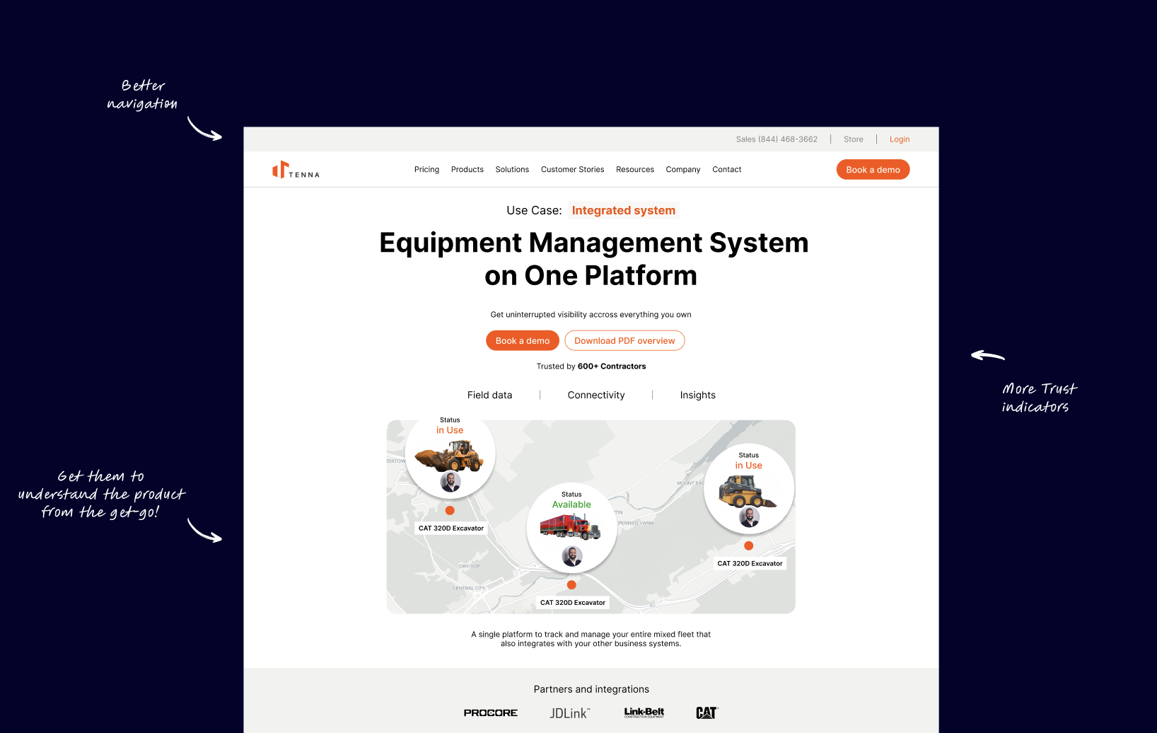
How Tenna can redesign their solutions page to get $1m extra revenue in 2026
I redesigned part of Tenna’s website to help them unlock an extra $1M in projected revenue for 2026.
After spotting a weak point in their buyer journey, I reworked the page to make it clearer, faster, and easier to act on. The new design explains the product better, builds trust early, and reduces the mental effort it takes for potential buyers to book a demo. In B2B SaaS, even a small improvement in conversion speed can have a big impact.
And this one’s set to shorten Tenna’s sales cycle by around 5%.
Get the figma file here
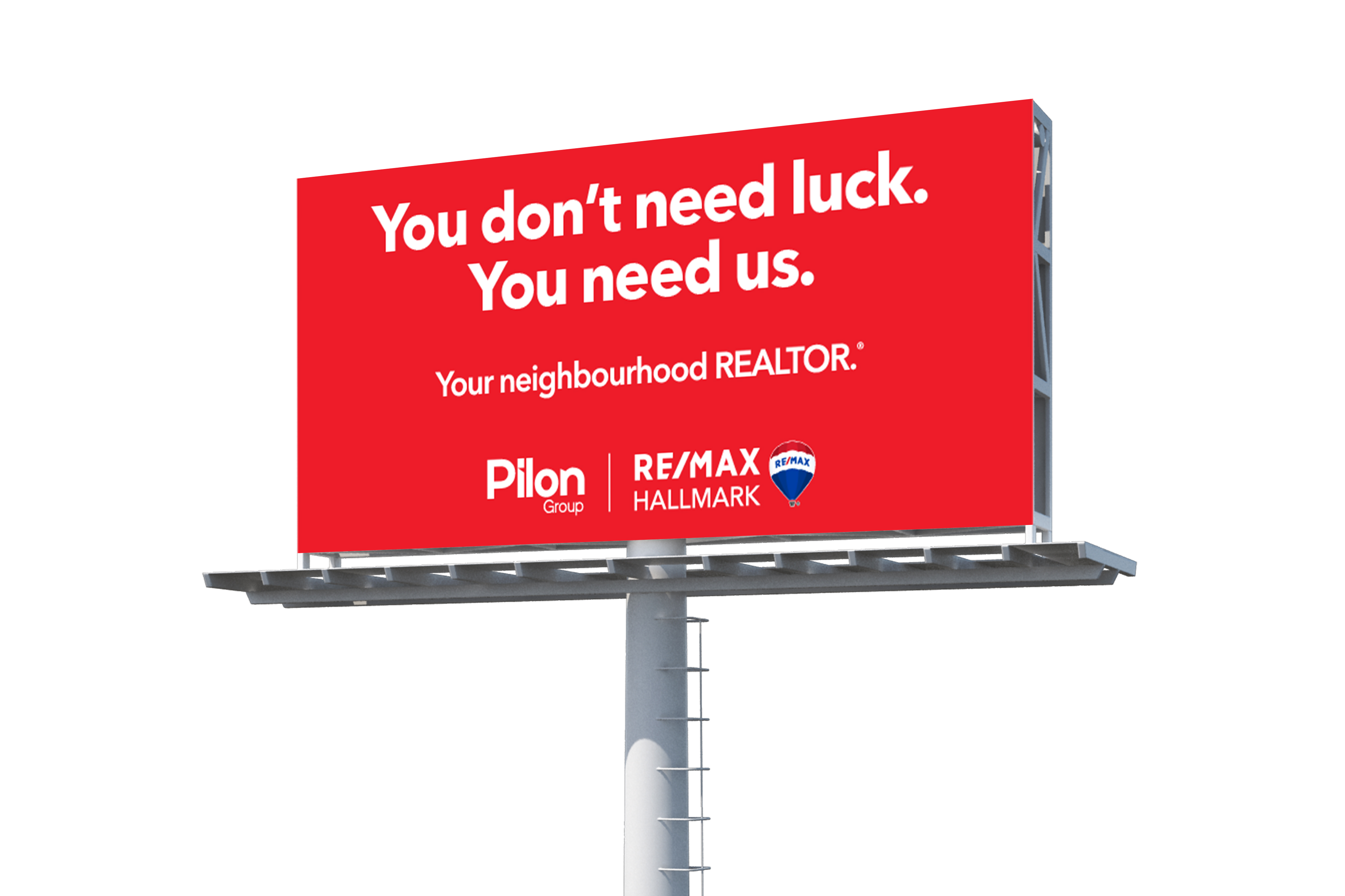
Pilon Group became the envy of Ottawa Real Estate
Pilon Group became the envy of Ottawa real estate by refusing to play by the rules. We built them a rebellious brand that challenged the quiet conformity of their market and redefined what a RE/MAX partner could look like. As complaints rolled in from competitors clinging to “the code,” Pilon stood taller owning their difference and dominating attention.
From billboards to business cards, postcards to presentations, we painted Ottawa red literally! Establishing a visual language that made Pilon impossible to ignore. The result: a brand that you couldn't ignore.
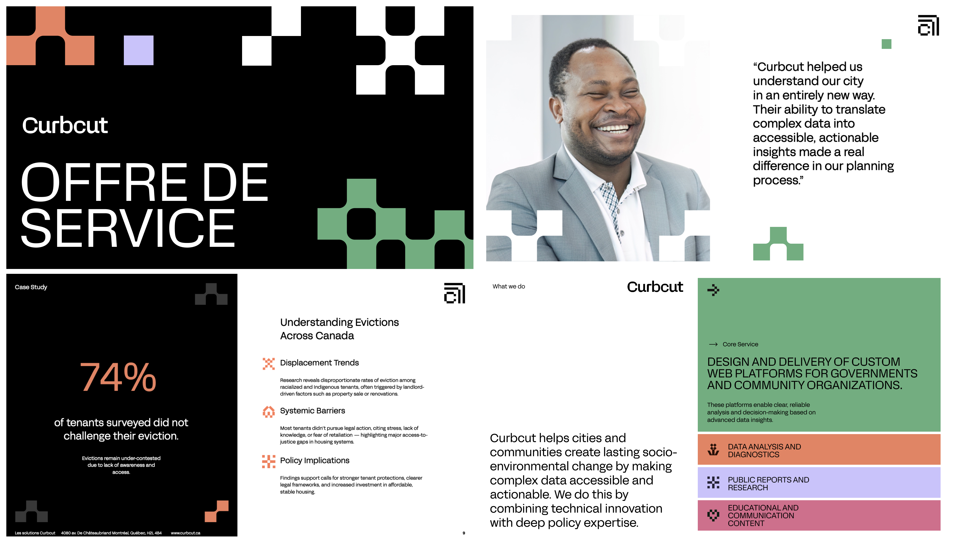
Curbcut’s new sales narrative unlocked a $30k win overnight
I redesigned Curbcut’s offer-of-services deck, turning dense internal documents into a modular, sales-ready system.
The new narrative clarified their value, tightened their pitch, and cut proposal creation from hours to minutes. On its very first use, the deck helped them close a $30k deal and became the team’s new default for every opportunity going forward.

The Intuitive way these homebuilders can avoid buyer dropoff on their website
This redesign explores how a large, established homebuilder like Schell Brothers can use their website not just to showcase homes—but to better guide buyers through a complex, emotional decision-making process.
At this stage, the focus isn’t visual polish for its own sake. It’s about structure, clarity, and intent. Homebuyers coming to a site like this aren’t looking to be sold immediately—they’re looking to understand the process, compare options, and feel confident they’re making the right long-term decision. The challenge is helping them do that without overwhelming them.

A full rebrand and website for this Industrial heating Startup.

The way we graduated a residential masonry contractor to Commercial projects using his website
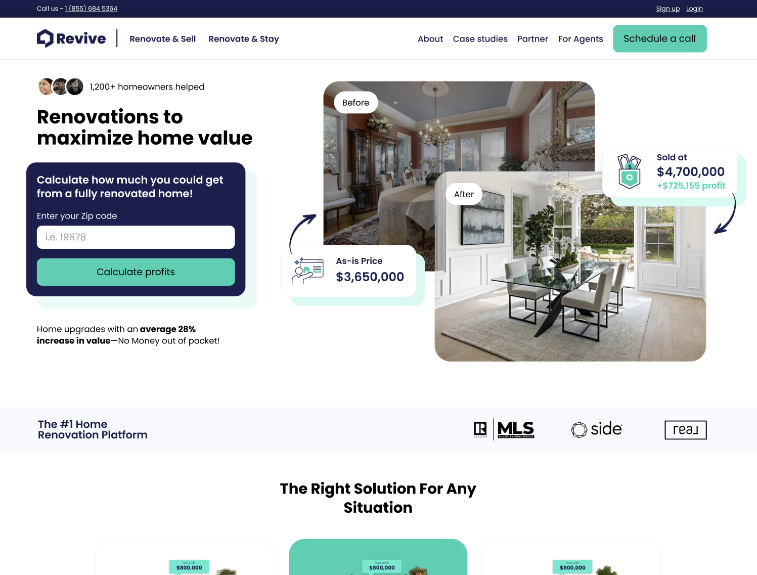
The way Revive can align their website to their expansion aspirations
This homepage redesign for Revive Real Estate focused on making their value proposition immediately clear to homeowners considering a renovation. The goal was to reduce friction in the first few seconds of the experience by clarifying what Revive does, who it’s for, and why it matters—so visitors can quickly understand the benefit and feel confident taking the next step.
The redesign emphasizes clearer supporting imagery, a more meaningful call to action, and trust indicators placed prominently throughout the page to reinforce credibility as users scroll. Together, these changes create a smoother path from landing to understanding to conversation, helping Revive turn more website visitors into qualified homeowner inquiries.

You want to work with someone that understands your business
Heading 1
Heading 2
Heading 3
Heading 4
Heading 5
Heading 6
Lorem ipsum dolor sit amet, consectetur adipiscing elit, sed do eiusmod tempor incididunt ut labore et dolore magna aliqua. Ut enim ad minim veniam, quis nostrud exercitation ullamco laboris nisi ut aliquip ex ea commodo consequat. Duis aute irure dolor in reprehenderit in voluptate velit esse cillum dolore eu fugiat nulla pariatur.
Block quote
Ordered list
- Item 1
- Item 2
- Item 3
Unordered list
- Item A
- Item B
- Item C
Bold text
Emphasis
Superscript
Subscript
Proven track record of design leadership.

Partners


Projects coming soon