Clarify the goal
--
My goal is simple:
Help users understand what they’re seeing, why it matters, and what to do next.
I help teams translate technical products, data-heavy platforms, and complex services into clear digital experiences that people can understand, trust, and use.
I work best with teams that have complex products, services, or data.
--
--
UX/UI portfolio
Reducing authentication friction for travellers who need urgent access to their flight
This self-initiated concept project explores how Iberia could help passengers access essential flight information without depending entirely on account login.

Lorem ipsum dolor sit amet, consectetur adipiscing elit. Suspendisse varius enim in eros elementum tristique. Duis cursus, mi quis viverra ornare, eros dolor interdum nulla, ut commodo diam libero vitae erat. Aenean faucibus nibh et justo cursus id rutrum lorem imperdiet. Nunc ut sem vitae risus tristique posuere.
Project summary
CloseThis self-initiated concept project explores how Iberia could help passengers access essential flight information without depending entirely on account login.

Airline apps are often used in time-sensitive situations.
Passengers may open the app shortly before travelling because they need to:
However, many of the reviews I analysed described users being unable to access these tasks because their account was blocked, their password had expired, or the recovery process had failed.
This creates a particularly stressful situation: the user already has a valid booking, but the application prevents them from reaching the information they need. Or the essential information is buried inside screens.
The main challenge was therefore finding a way to reduce the dependency between account authentication and access to an existing trip.

Because this was an independent project, I did not have access to Iberia’s internal analytics, support data, business rules, security requirements, or technical architecture. The direction was therefore based on public reviews, direct product observation, behavioural hypotheses, and assumptions that would need further validation.
I began by reviewing a large number of recent App Store reviews and grouping the most repeated complaints into four broad themes:
Users described:
Users reported:
Several reviews mentioned:
Users also expressed frustration around:
The research did not prove the scale of each issue, but it revealed a repeated pattern: users were often unable to complete high-priority travel tasks because access to their trip was tied too closely to account authentication.

From the reviews, I identified several likely behavioural patterns.
When users cannot access their account, they often:
I also observed that most sessions in an airline app are likely driven by a small set of high-intent tasks:
This suggested that access to an existing booking should be treated as a primary user intent, rather than as a secondary feature hidden behind login.

The main pain points identified were:
The most critical pain point was the combination of urgency and dependency:
Users may already have a valid reservation, but still be unable to reach it when they need it most.
Based on the research, I identified several possible opportunities:
I decided to focus on guest trip access because it appeared to offer the clearest balance between user value and implementation effort.
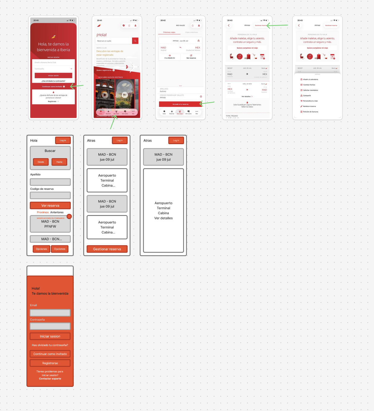
The Iberia app already contained elements of guest access, but they were not prominent enough in the main experience.
This meant the opportunity was not necessarily to create a completely new capability, but to make an existing one easier to discover and use.

The problem was framed as follows:
Users are getting their accounts blocked, or discovering that their password has expired, shortly before travelling. At the moment they need their flight information most, they may be forced to recover their account, move to the website, or contact support.
This leads to frustration because:
The user needs to:
The business could benefit from:
If this concept were implemented, I would evaluate:
I explored four directions:
The account reactivation wizard could have a high impact, but it would also require greater technical and operational effort.
Guest trip access appeared to provide meaningful value with lower effort because it could build on an existing reservation retrieval mechanism.
For that reason, I selected it as the primary concept.

The final concept reorganises the app home around two primary user intents:
Instead of forcing every traveller to begin with authentication, the home screen includes a visible Mis viajes section.
Users can retrieve a reservation using:
Once the booking is found, they can view the most important trip information without creating or recovering an account.
This includes:
From the reservation detail, the user can access contextual actions such as:

A guest experience should not remove necessary security controls.
The concept therefore separates access into two levels.
After entering surname and booking reference, the user can view essential trip information.
Actions such as cancellation, date changes, refunds, or personal-data updates may require an additional verification step.
This could include:
The purpose of the concept is not to eliminate authentication, but to avoid making full account access a prerequisite for every travel-related task.

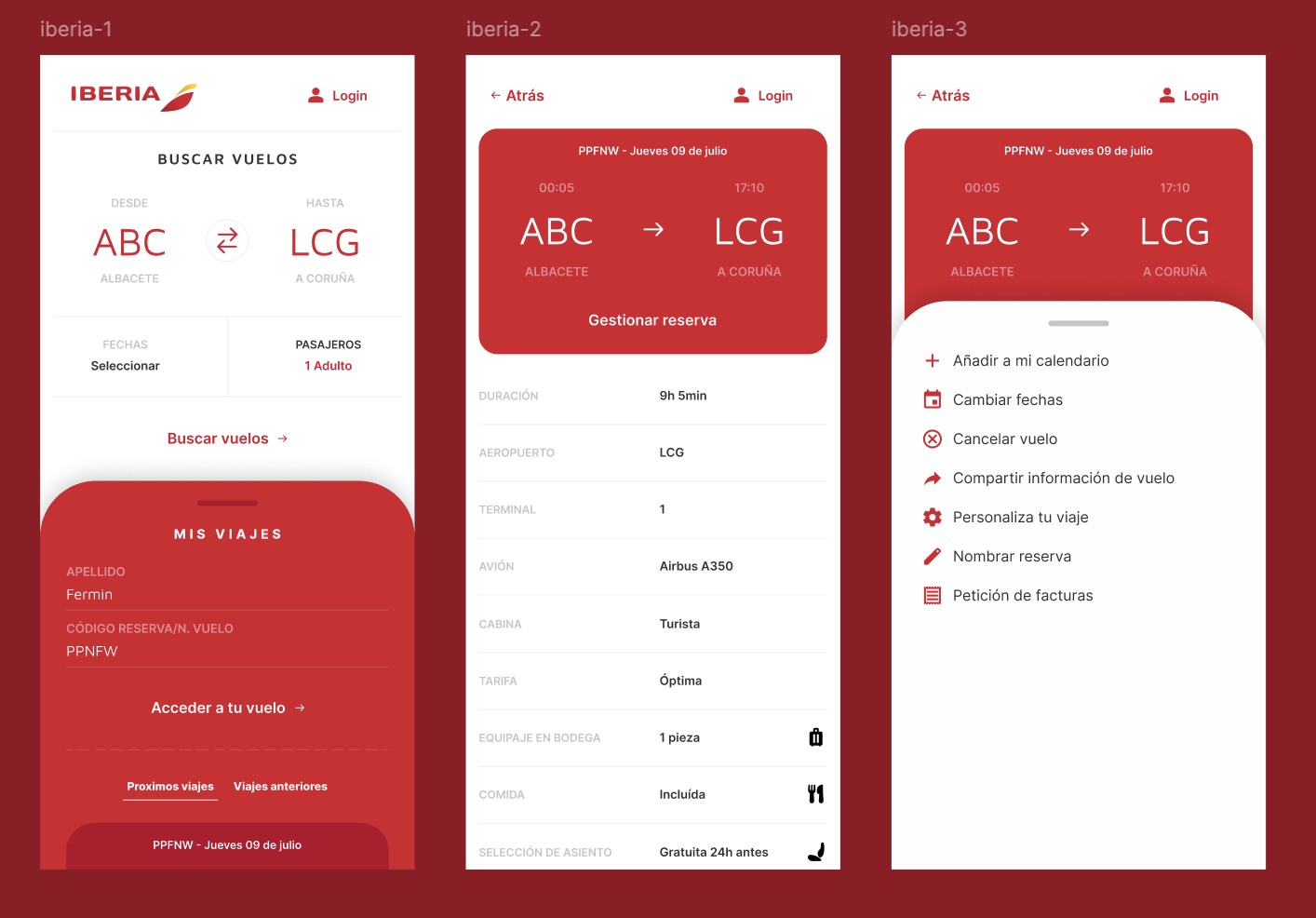
The first screen gives equal visibility to two important tasks:
By placing Mis viajes directly on the home screen, the guest flow becomes discoverable at the point where users already begin.
After entering the booking information, users reach a simplified trip view containing the information most likely to be needed in an urgent travel context.
The hierarchy prioritises:
Secondary details are presented below in a clear, scannable structure.
A contextual action panel provides access to the tasks associated with the booking.
This avoids overwhelming the main detail screen while still making management options easy to reach.

Several design decisions shaped the final concept.
The main conceptual change was to stop treating login as the default gateway to the application.
Users do not open an airline app because they want to authenticate. They open it because they need to do something related to a trip.
The flow aims to reduce the need to move between:
The reservation detail focuses on the information users are most likely to need shortly before a flight.
The interface uses familiar airline patterns and keeps Iberia’s visual language, rather than introducing an entirely new interaction model.
The first level shows essential information. More complex reservation actions appear only when the user requests them.

This project is based on public feedback and product observation.
I did not have access to:
The public reviews also represent a self-selecting sample and may overrepresent users who experienced serious problems.
For that reason, the findings should be treated as directional rather than conclusive.
The next step would be to test the concept with travellers who have previously experienced:
The research would focus on whether users:
I would also test edge cases such as:
The project began with a large set of negative reviews that appeared to describe many different problems.
After grouping the feedback, one underlying issue became clearer:
Access to a trip was too dependent on successful account authentication.
The final concept does not attempt to redesign Iberia’s full authentication system.
Instead, it reframes the app around the task the user is actually trying to complete.
By making guest trip access visible from the home screen, the experience could help travellers retrieve essential information more quickly, reduce unnecessary channel switching, and create a more resilient path for users who cannot access their account.
The concept would require further validation with users, engineering, security, customer support, and business stakeholders.
However, it demonstrates how a focused change in information architecture and entry-point hierarchy could reduce friction in one of the most time-sensitive moments of the travel experience.
Repositioning a construction company to 2x their revenue in 1 year
360 House Remodeling is a Seattle-based remodeling company looking to reposition itself towards higher-value residential projects while preparing its website for a long-term SEO and content strategy. I led the project end-to-end, from information architecture and UX to design systems and Webflow implementation, creating a scalable platform that supported both business growth and future marketing efforts.

Lorem ipsum dolor sit amet, consectetur adipiscing elit. Suspendisse varius enim in eros elementum tristique. Duis cursus, mi quis viverra ornare, eros dolor interdum nulla, ut commodo diam libero vitae erat. Aenean faucibus nibh et justo cursus id rutrum lorem imperdiet. Nunc ut sem vitae risus tristique posuere.
Project summary
Close360 House Remodeling is a Seattle-based remodeling company looking to reposition itself towards higher-value residential projects while preparing its website for a long-term SEO and content strategy. I led the project end-to-end, from information architecture and UX to design systems and Webflow implementation, creating a scalable platform that supported both business growth and future marketing efforts.


The final website became the foundation for the company's SEO strategy and premium repositioning. By combining a scalable CMS, reusable design system and improved user experience, the platform enabled ongoing content growth while supporting a significant increase in business performance, with projected annual revenue more than doubling compared to the previous year.
Building a corporate web platform
1GS is a European corporate governance consultancy. I joined the project after it had been abandoned midway through development, with the goal of transforming an incomplete website into a professional, scalable digital platform that better reflected the company's expertise and supported its growth across Europe.

Lorem ipsum dolor sit amet, consectetur adipiscing elit. Suspendisse varius enim in eros elementum tristique. Duis cursus, mi quis viverra ornare, eros dolor interdum nulla, ut commodo diam libero vitae erat. Aenean faucibus nibh et justo cursus id rutrum lorem imperdiet. Nunc ut sem vitae risus tristique posuere.
Project summary
Close1GS is a European corporate governance consultancy. I joined the project after it had been abandoned midway through development, with the goal of transforming an incomplete website into a professional, scalable digital platform that better reflected the company's expertise and supported its growth across Europe.

1GS is a corporate governance consultancy operating across Europe. When I joined the project, the website had been abandoned midway through development, leaving the company with an inconsistent digital presence that no longer reflected the maturity of the business.

The challenge wasn't simply redesigning a website. The business needed a platform capable of communicating trust, professionalism and expertise to corporate clients across different European markets, while also consolidating a large amount of legal and informational content into a coherent experience.

I was responsible for transforming the existing work into a coherent web experience by designing the interface, structuring the information architecture, integrating new visual assets, and collaborating on the implementation of the final website.

To keep such a large website maintainable, I relied on reusable layouts, shared UI patterns and consistent spacing and typography across the different sections.

The project had already started before I joined, meaning many structural decisions had already been made. Rather than redesigning everything from scratch, my work focused on bringing consistency, improving clarity and completing the experience within existing constraints.

The result was a complete corporate website capable of presenting 1GS as a mature European consultancy while supporting recruitment, legal documentation and business development through a much more structured digital experience.
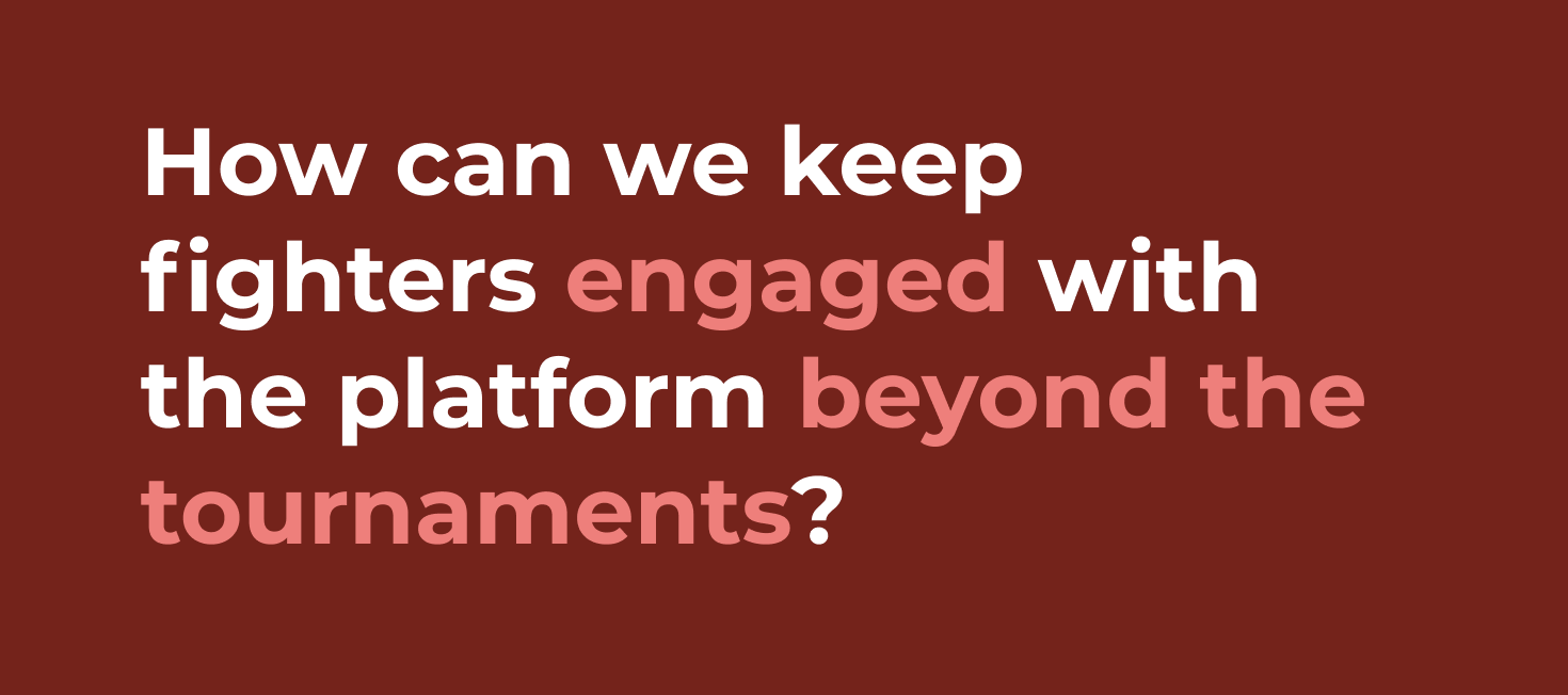
One account. Multiple athletes. Zero confusion.
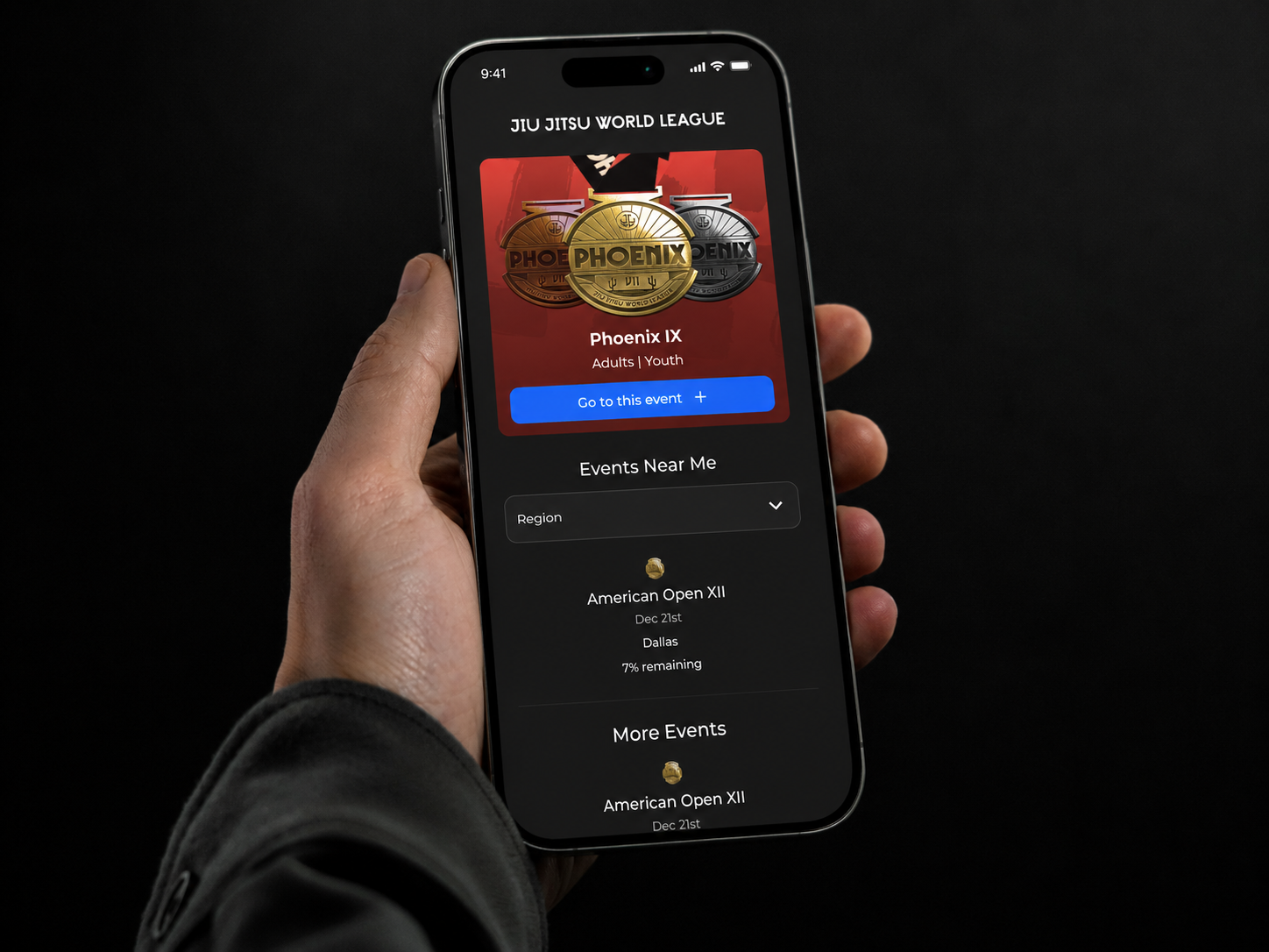
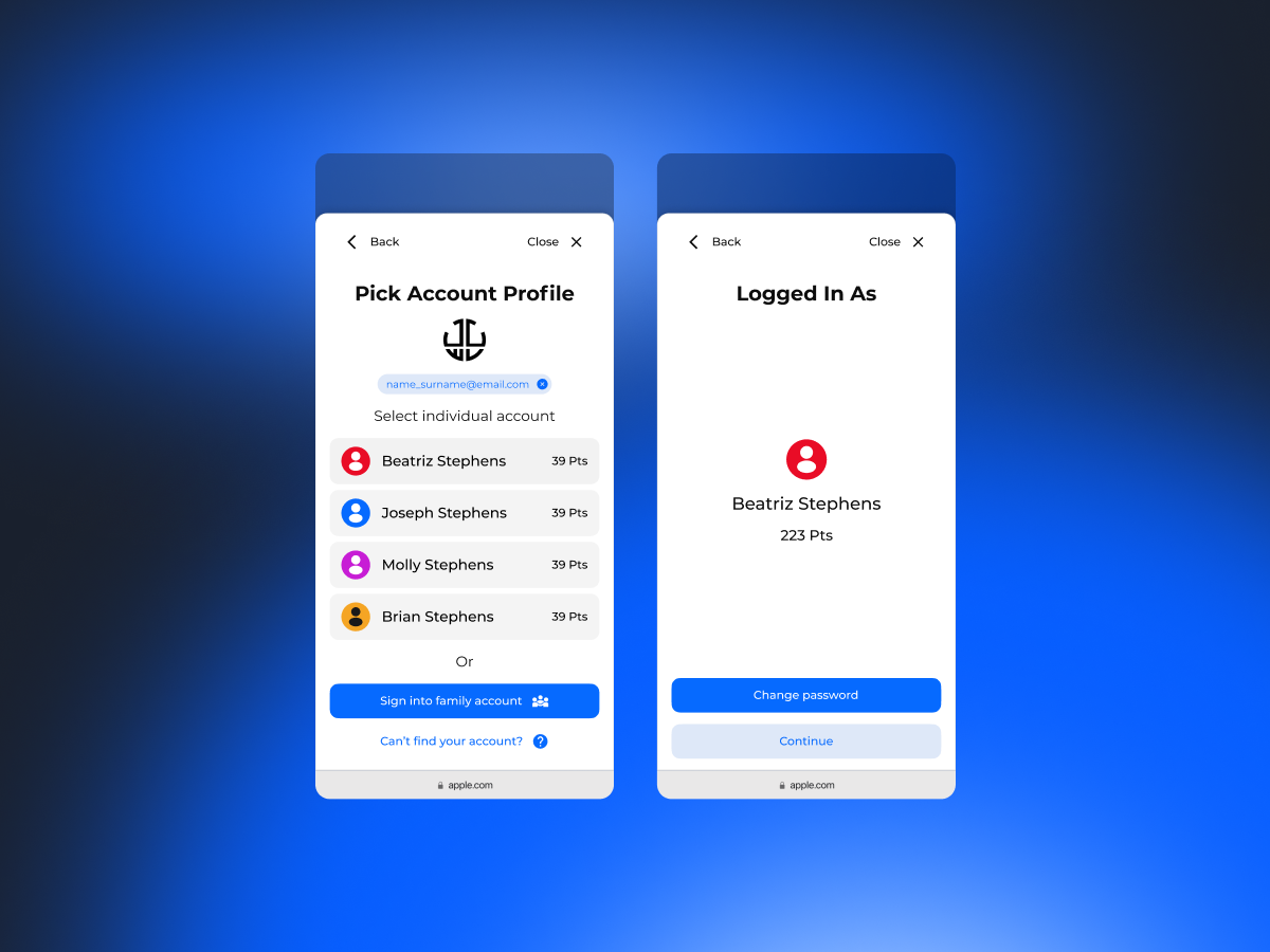
Designed a scalable multi-user authentication experience that enabled parents to manage multiple athletes under a single account while making profile switching fast, intuitive, and error-free.

Lorem ipsum dolor sit amet, consectetur adipiscing elit. Suspendisse varius enim in eros elementum tristique. Duis cursus, mi quis viverra ornare, eros dolor interdum nulla, ut commodo diam libero vitae erat. Aenean faucibus nibh et justo cursus id rutrum lorem imperdiet. Nunc ut sem vitae risus tristique posuere.
Project summary
CloseDesigned a scalable multi-user authentication experience that enabled parents to manage multiple athletes under a single account while making profile switching fast, intuitive, and error-free.

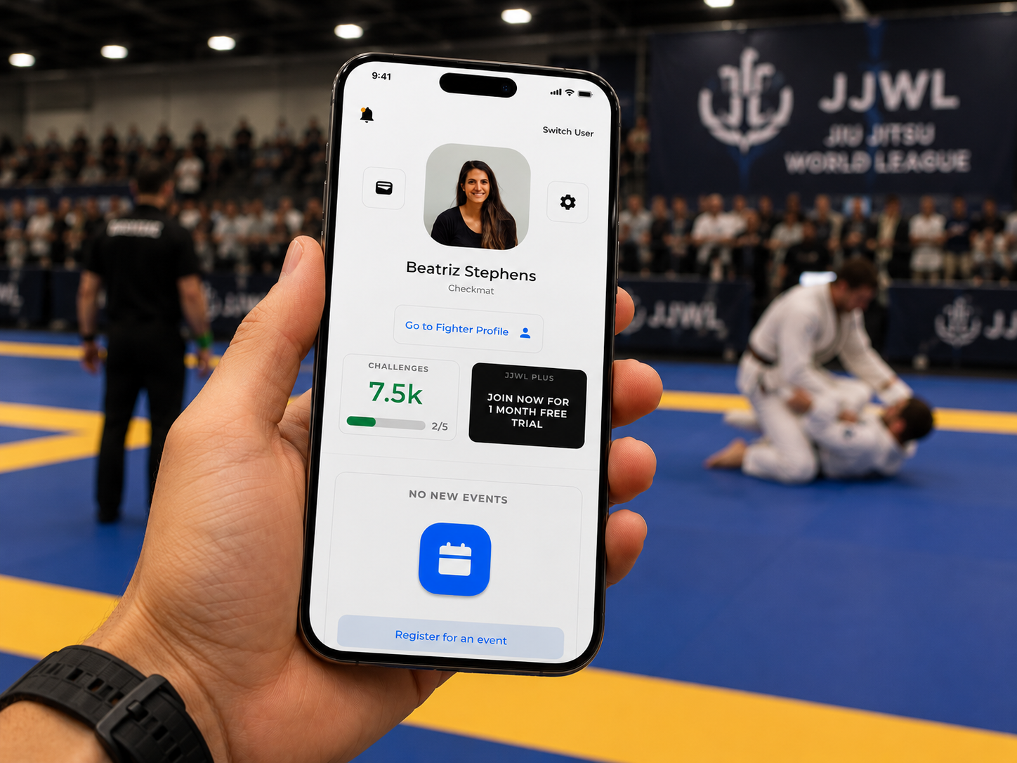
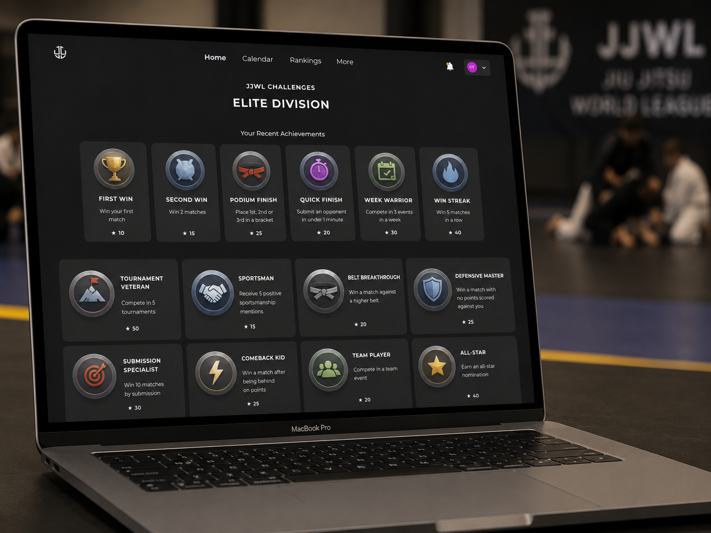
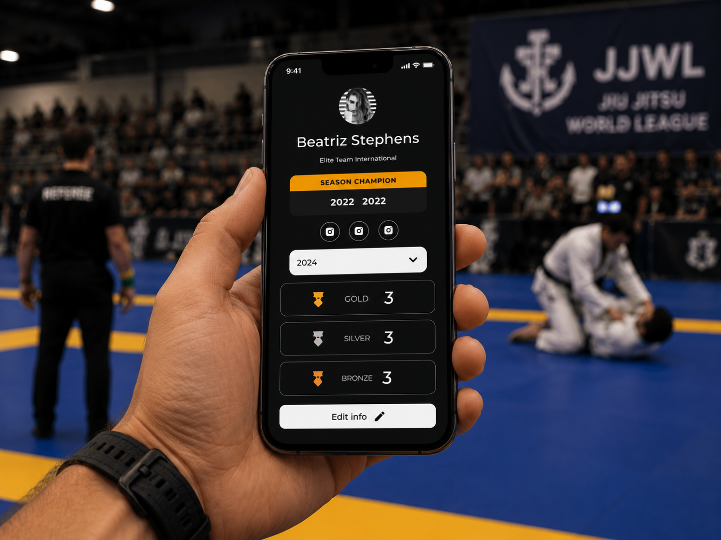
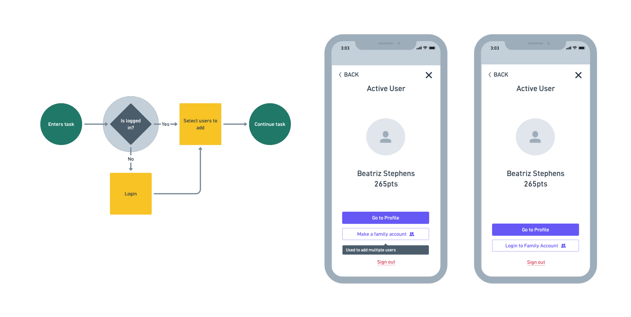
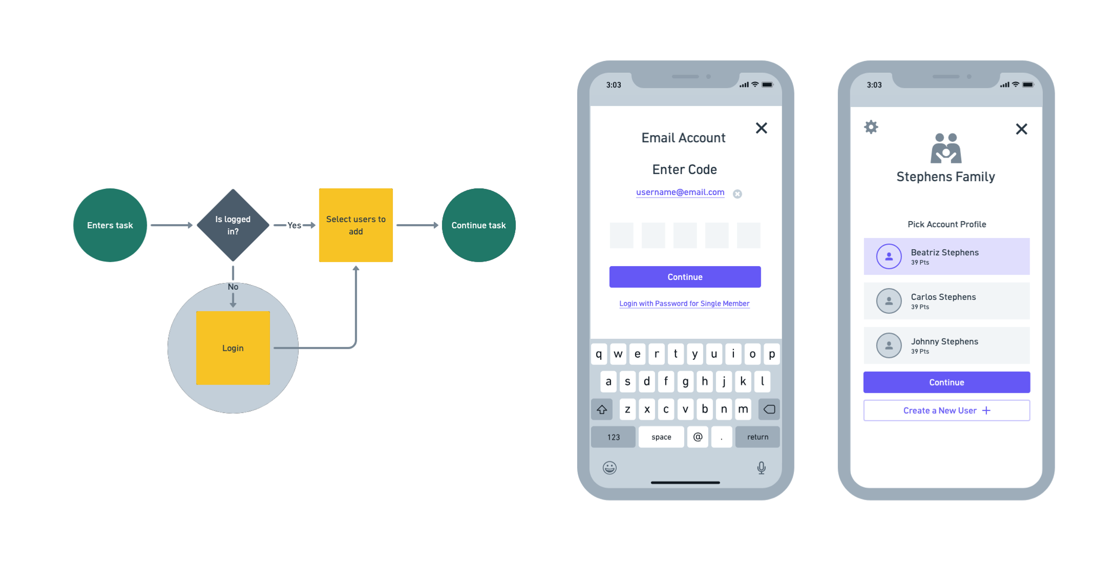
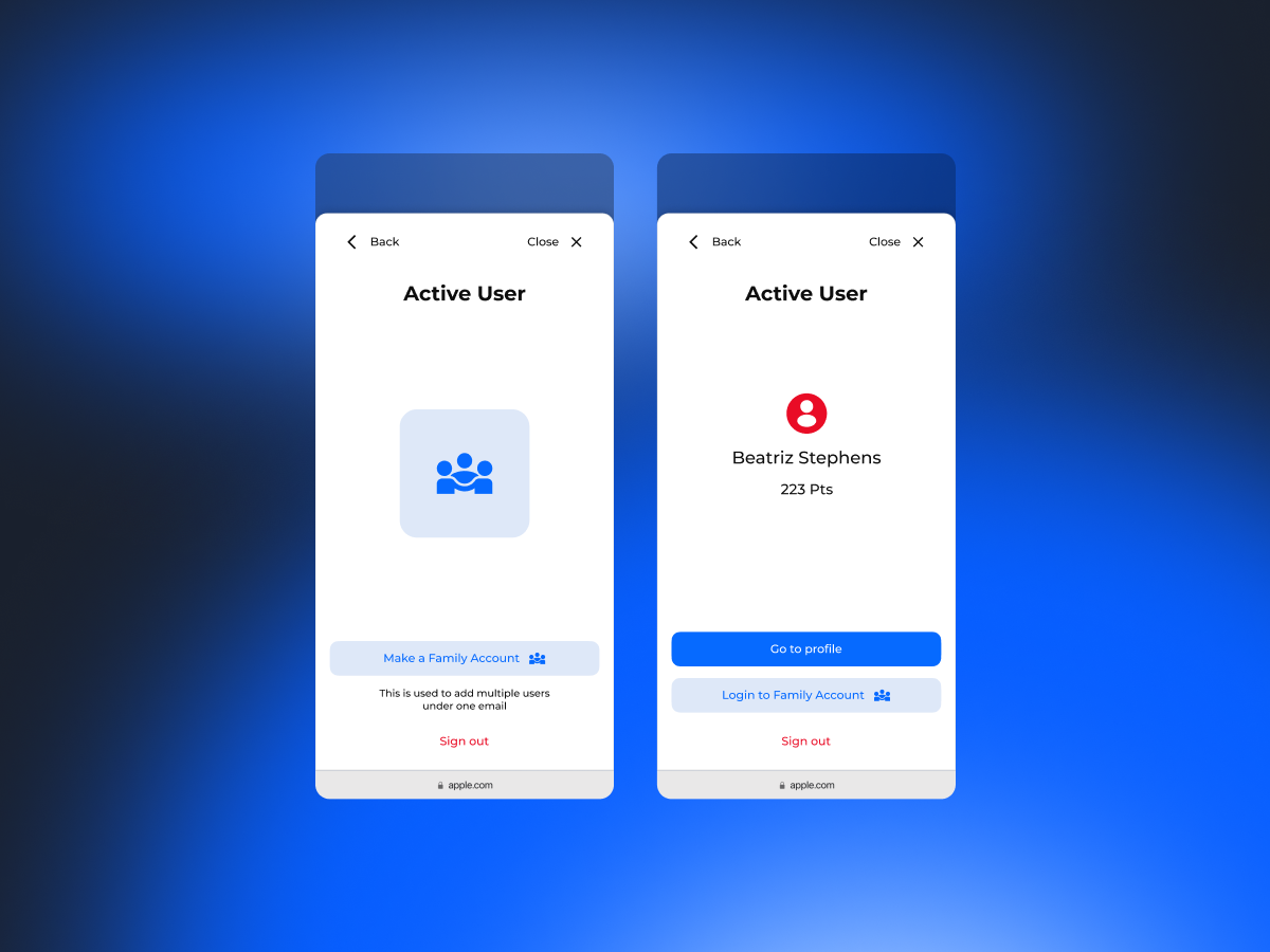
Designed a multi-user authentication flow that allowed parents to manage multiple athletes from a single account while making it easy to switch between individual competitors without logging in and out.
JJWL serves a large number of youth athletes.
Parents typically register and manage multiple competitors under a single email account, while minors often don't have direct access to that email.
Traditional authentication models assume a 1:1 relationship between a user and an account, but JJWL required one account to manage multiple users, each with different permissions and responsibilities.

Without a clear account model, users struggled to:
Users should be able to:


The resulting flow allowed a single authenticated account to manage multiple athletes while keeping the active user explicit throughout the experience. This reduced ambiguity, simplified family account management, and created a foundation that could scale to additional roles such as coaches and academy administrators.
Creating actionable Canadian housing data
The Canadian Housing Observatory is a digital platform designed to bring together housing data from multiple sources and present it in a way that is accessible to policymakers, community leaders, researchers, and people without technical expertise.

Lorem ipsum dolor sit amet, consectetur adipiscing elit. Suspendisse varius enim in eros elementum tristique. Duis cursus, mi quis viverra ornare, eros dolor interdum nulla, ut commodo diam libero vitae erat. Aenean faucibus nibh et justo cursus id rutrum lorem imperdiet. Nunc ut sem vitae risus tristique posuere.
Project summary
CloseThe Canadian Housing Observatory is a digital platform designed to bring together housing data from multiple sources and present it in a way that is accessible to policymakers, community leaders, researchers, and people without technical expertise.

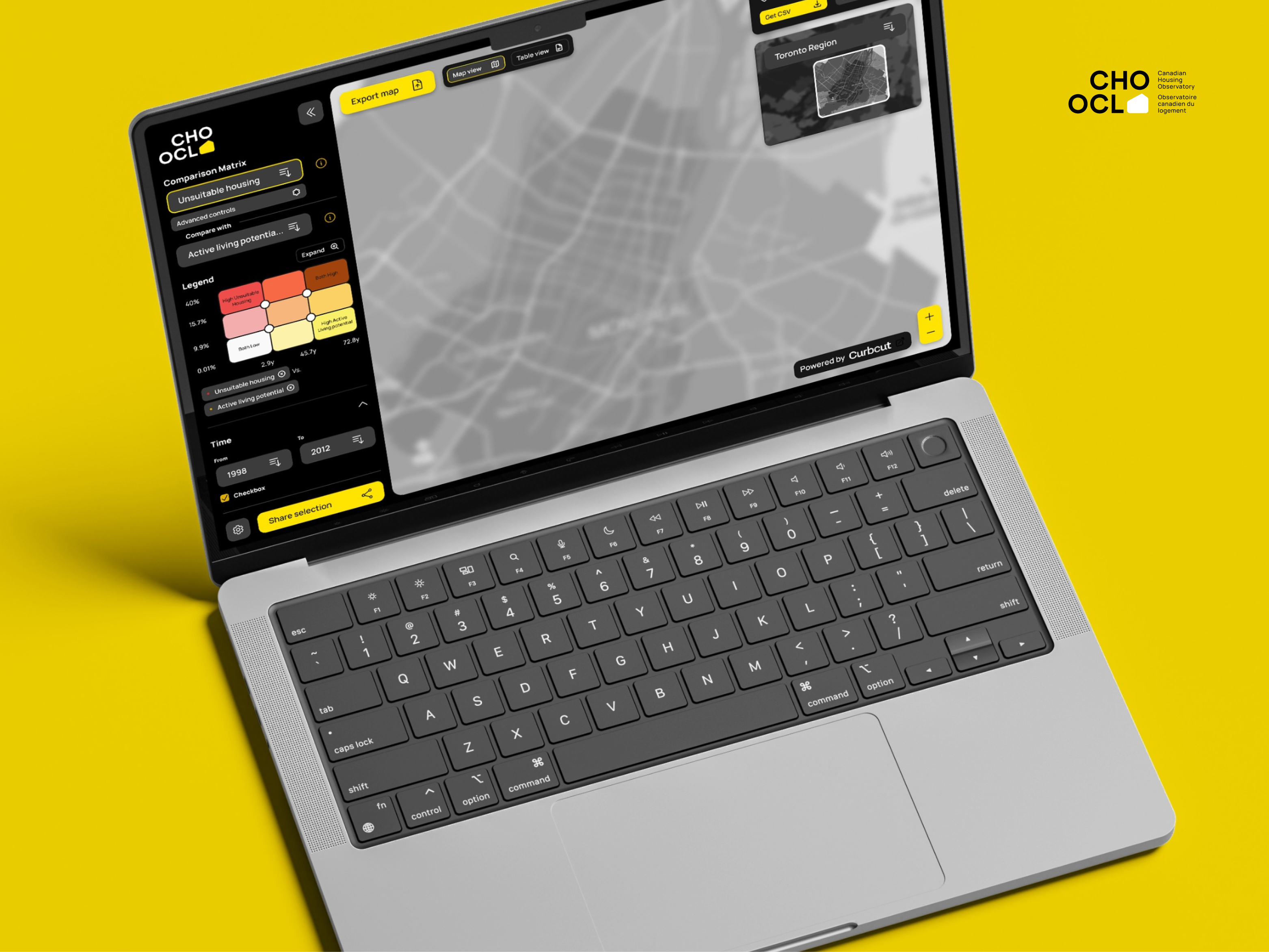
The Canadian Housing Observatory is a web platform that brings together housing data from multiple sources.
It was designed for policymakers, researchers, community leaders, and non-technical audiences who needed to understand housing conditions across different regions, time periods, and indicators.
My role focused on turning a complex dataset into a clear product experience through:
The main design challenge was balancing analytical depth with an interface that remained approachable.

Canadian housing data was distributed across different sources, formats, geographic scales, and time periods.
Users needed to:
The challenge was to support all of this without turning the product into an overwhelming analytics tool.
How might we make complex housing data useful to both technical and non-technical audiences?
Role: UX/UI Designer / Product Designer
Responsibilities: Information architecture, interaction design, prototyping, visual design, and component systems

The product needed to help users:
These insights came from the project requirements, data structure, and interaction challenges.
The map made geographic patterns easier to recognize.
The table made exact values easier to inspect and export.
The product needed both.
Viewing one indicator at a time only showed part of the story.
Users needed to understand how two conditions related to one another across different regions.
Indicators included secondary variables, geographic levels, and historical data.
The interface needed to reveal this complexity gradually.
A screenshot could show a map, but not the analysis behind it.
Shared links needed to preserve the selected indicators, year, scale, and location.
Users needed to move between patterns, relationships, and exact values without losing the context of their analysis.
This became the foundation of the product structure.

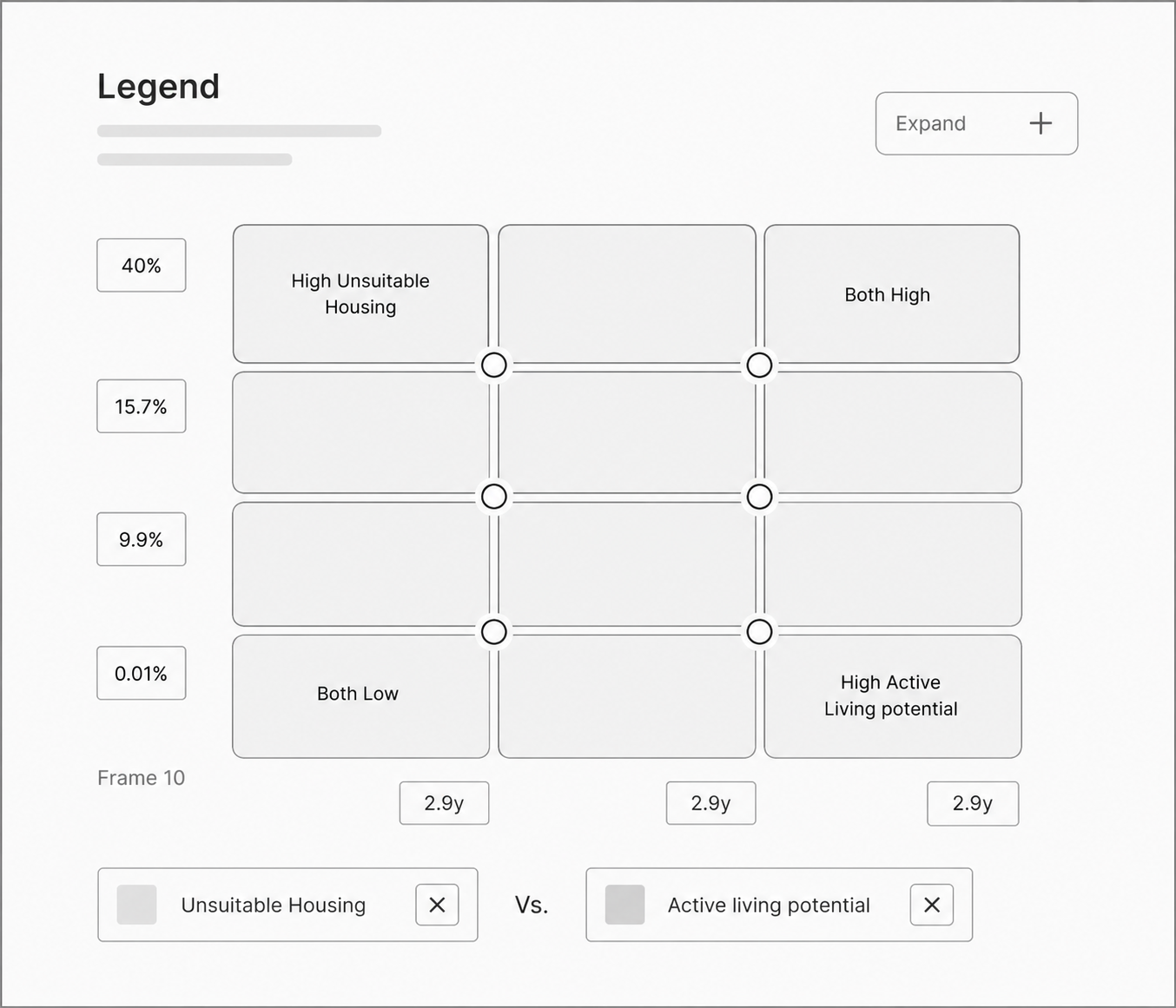
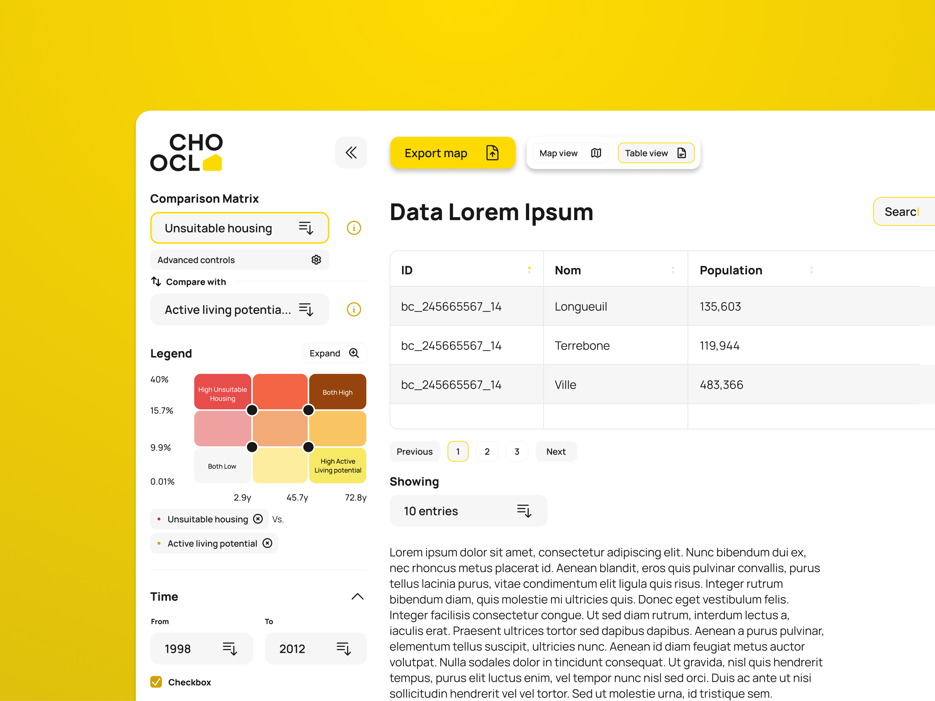
We created a color-coded matrix that represented the relationship between two variables.
For example:
These combinations were applied directly to the map.
This removed the need for users to mentally combine two separate datasets.

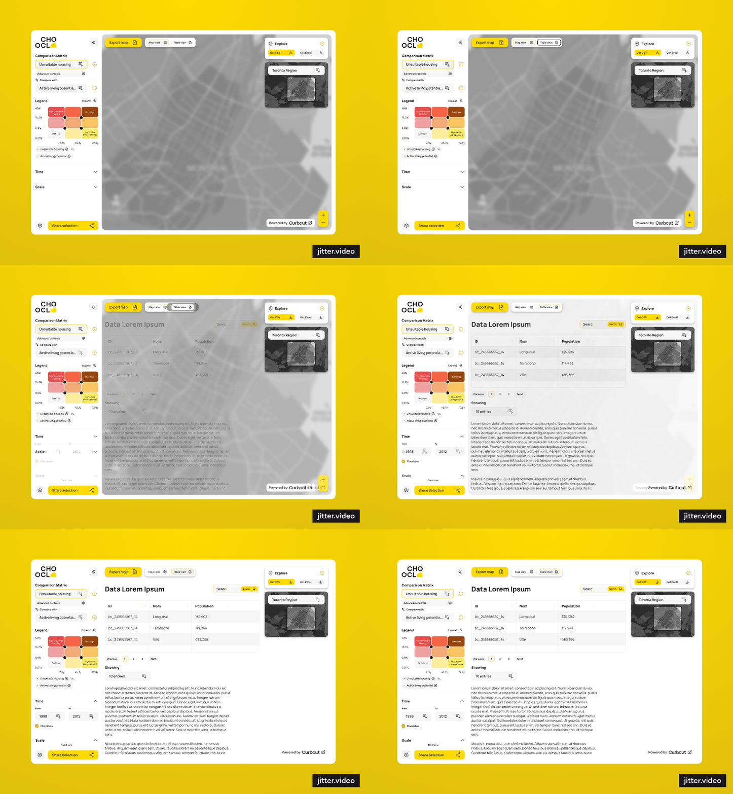
The map supported pattern recognition.
The table supported exact values, comparison, and export.
Users could move between both views while keeping the same analysis active.
The main controls remained visible, while secondary variables and advanced settings were grouped inside expandable sections.
This kept the product approachable without removing depth.

Once users had configured their analysis, they could collapse the sidebar and dedicate more space to the map.
The product stored the analysis state through URL parameters.
Shared links opened the same indicators, year, geographic scale, and map configuration.
The final solution allowed users to:
The interface was supported by a reusable system of selectors, panels, sliders, tables, legends, and map controls.


The project was shaped by:
Because the comparison matrix relied heavily on color, a future improvement would be to reinforce its meaning with labels, patterns, or symbols.

The next research phase would focus on:
The design established a unified way to explore, compare, export, and share Canadian housing data.
It also created an interface structure and component system that could support additional indicators and future product development.
I did not have access to post-launch usage metrics, so I do not claim a measured improvement in user performance.
The main challenge was deciding how users could move between geographic patterns, indicator relationships, and exact values without losing their place.
The project reinforced a simple principle:
Complex products do not always need fewer features. They need clearer relationships between those features.
Designing a Mental Model for Canada's Ecosystem Services
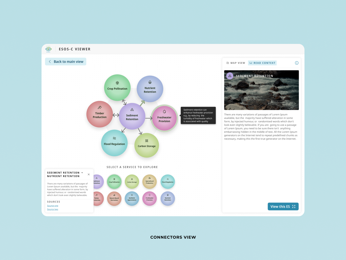
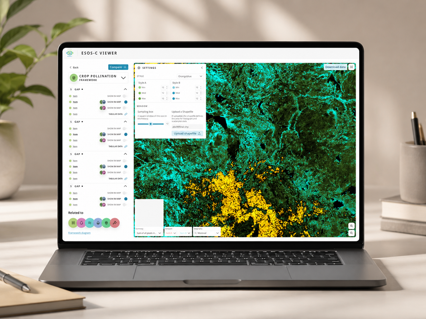
ESOS-C is an ecosystem services platform developed with ResNet and CurbCut. Its goal was to make interconnected ecological data understandable for researchers, planners, policy makers, NGOs, and students, without sacrificing scientific credibility.

Lorem ipsum dolor sit amet, consectetur adipiscing elit. Suspendisse varius enim in eros elementum tristique. Duis cursus, mi quis viverra ornare, eros dolor interdum nulla, ut commodo diam libero vitae erat. Aenean faucibus nibh et justo cursus id rutrum lorem imperdiet. Nunc ut sem vitae risus tristique posuere.
Project summary
CloseESOS-C is an ecosystem services platform developed with ResNet and CurbCut. Its goal was to make interconnected ecological data understandable for researchers, planners, policy makers, NGOs, and students, without sacrificing scientific credibility.

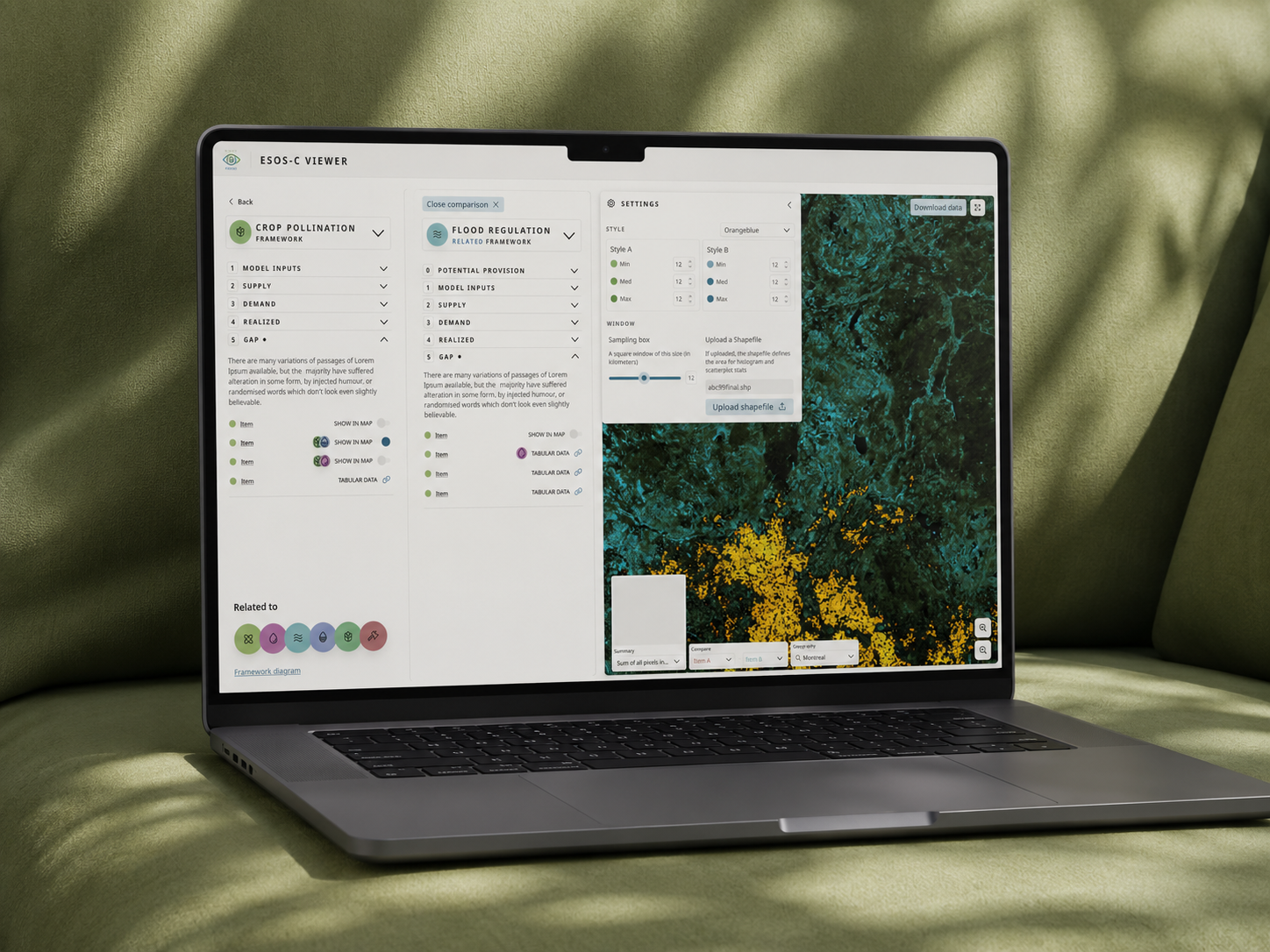
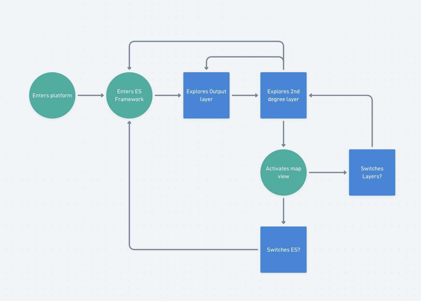
The platform contained a rich scientific model describing how ecosystem services influence one another across Canada.
Researchers already understood these relationships.
Everyone else didn't.
Users often explored one ecosystem service at a time without understanding how changes affected the rest of the system. The challenge was to transform a complex scientific framework into an experience that people could navigate naturally.

Product Design
UX/UI
Information Architecture
Interaction Design
Concept Exploration
Design Systems
Workshops
This project would be successful if users could:

People needed a mental model before a map.
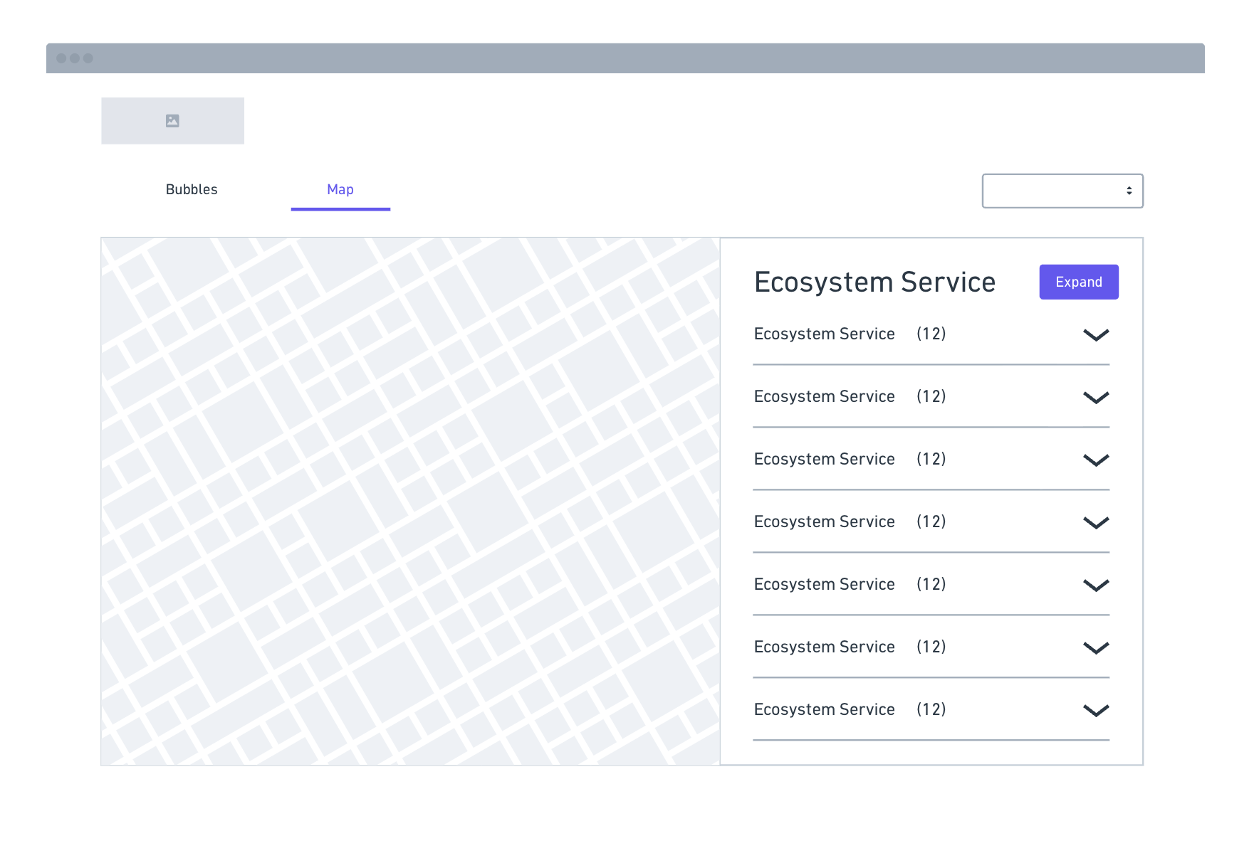
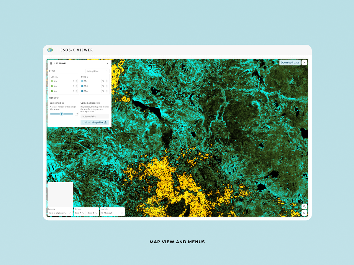
Initially we assumed the map would become the primary way users explored ecosystem services.
Instead, we realized that without understanding the relationships between services first, the map became little more than a collection of colorful layers.
Users needed context before exploration.
This insight shaped almost every design decision afterwards.


Too much information at once

Chosen because it balanced learning with exploration.

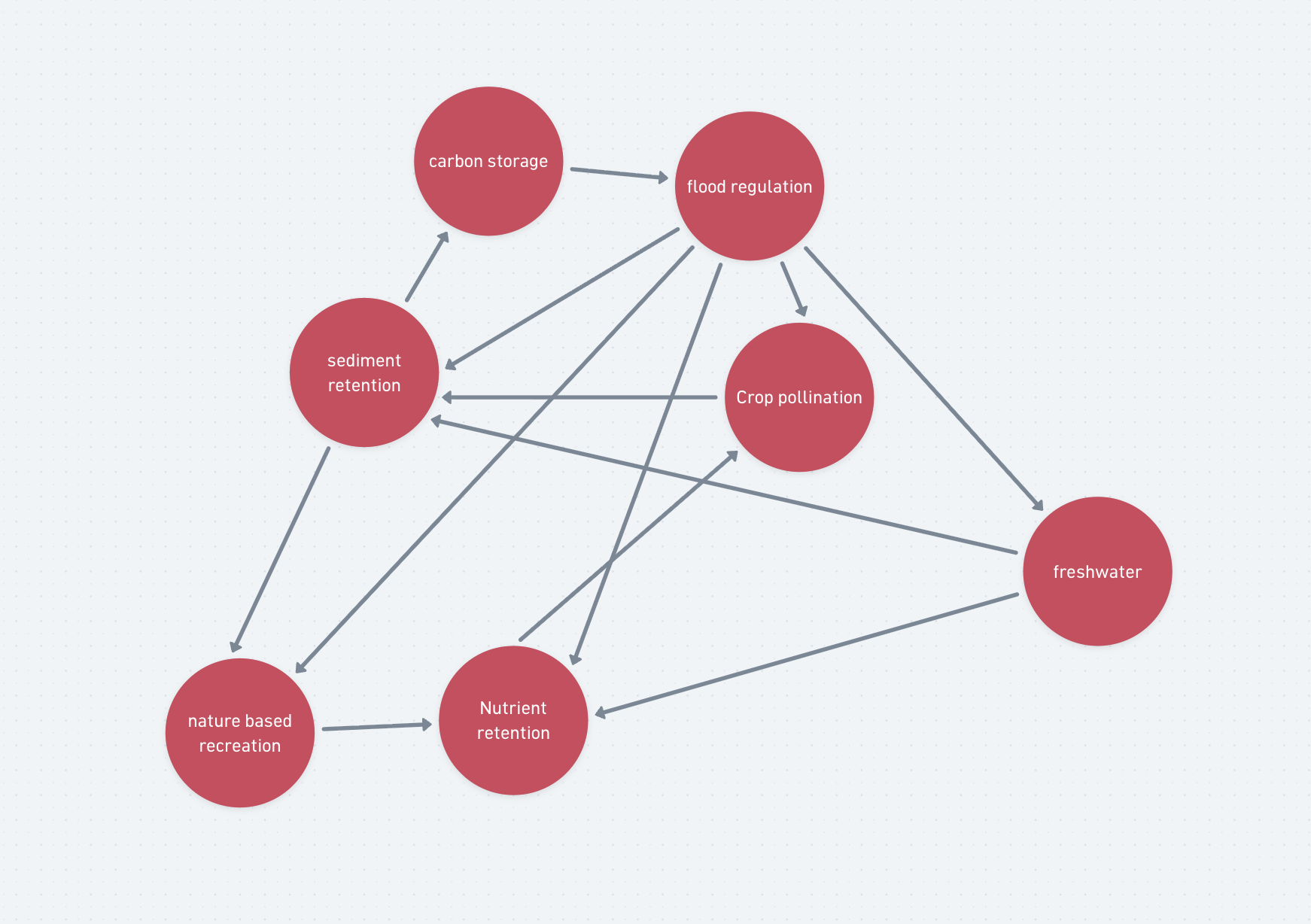
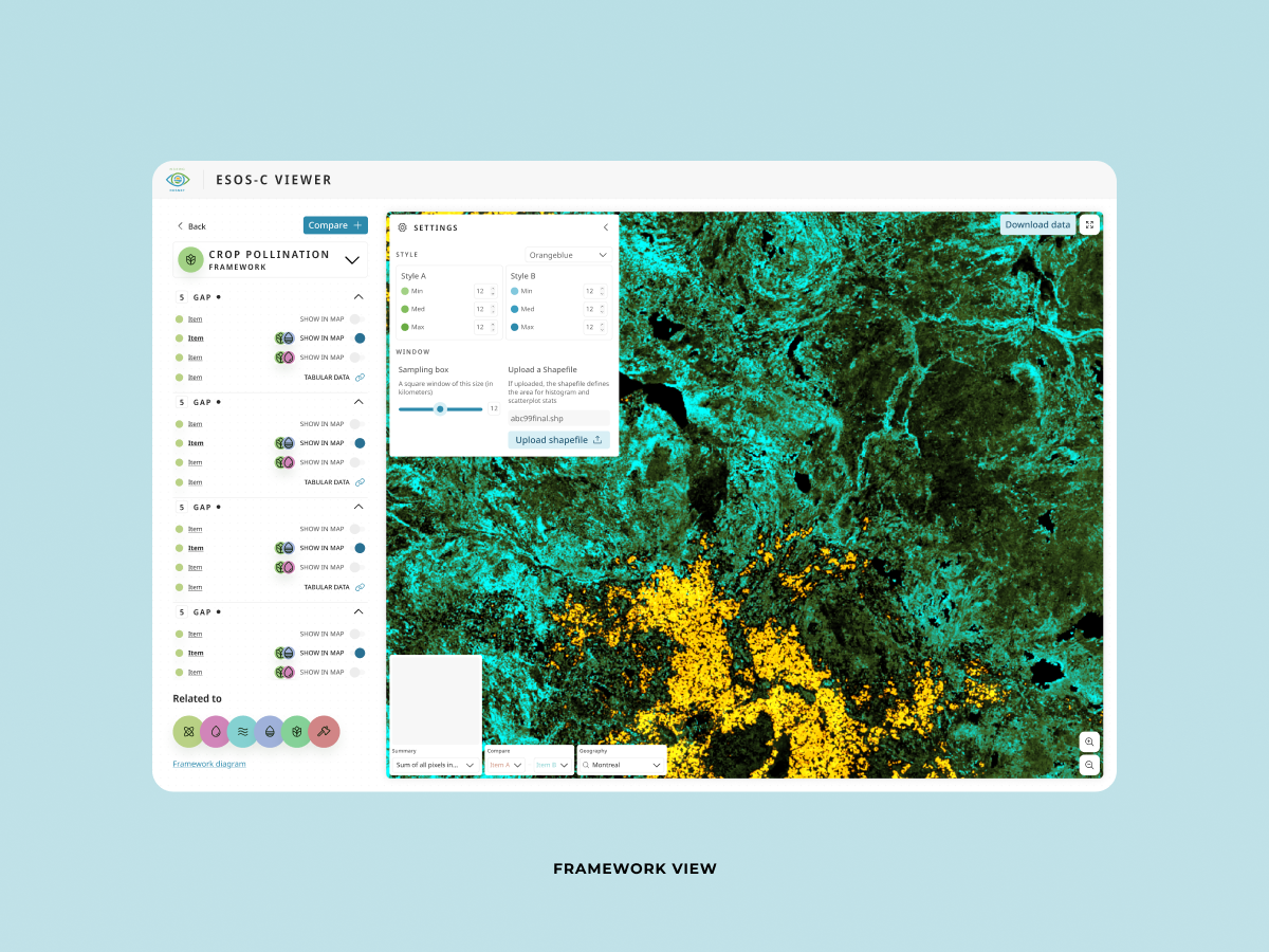
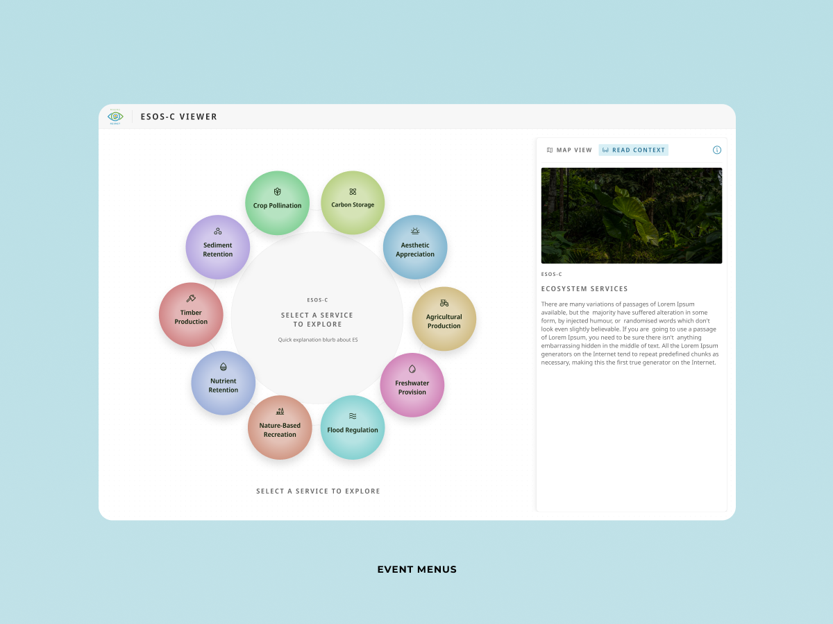
Every ecosystem service connected to several others.
Each relationship opened additional model inputs.
Each model input unlocked spatial layers.
Without structure, users could easily lose track of where they were.
We designed a layered exploration model that kept users oriented while still allowing free exploration.

Rather than showing every scientific relationship immediately, information was introduced in layers.


I'd test:

This project changed the way I think about complexity.
Good UX is about helping people build the right mental model before asking them to make decisions.
The biggest design challenge isn't simplifying the interface.
It's deciding what people need to understand first.
One question guided every decision during this project:
"What does someone need to understand before the next screen makes sense?"
That question influenced where the map appeared.
It influenced why we kept the relationship graph.
It influenced how we presented the scientific framework.
It influenced how users moved through the product.
In the end, I realized I wasn't designing a dashboard.
I was designing a way for people to think about a complex ecological system.

Relevant history
Individual contributor towards one of Adecco's biggest accounts. Telefonica.
Led product design throughout an assortment of data intensive apps in a startup context.
Led product design and brand experience for a high-traffic martial arts platform. Focused on usability, trust, interface clarity, and decision-making across complex user journeys.
Led web and digital design projects where user clarity, business requirements, and stakeholder alignment shaped the final experience.
Created visual systems and digital design foundations that improved clarity, consistency, and usability across multiple touchpoints.
Worked on brand and interface systems where consistency, hierarchy, and clear communication were essential across multiple user-facing materials.
Led high-visibility design projects, mentored junior designers, and strengthened systems thinking around clarity, hierarchy, and scalable visual decisions.

Contact info